


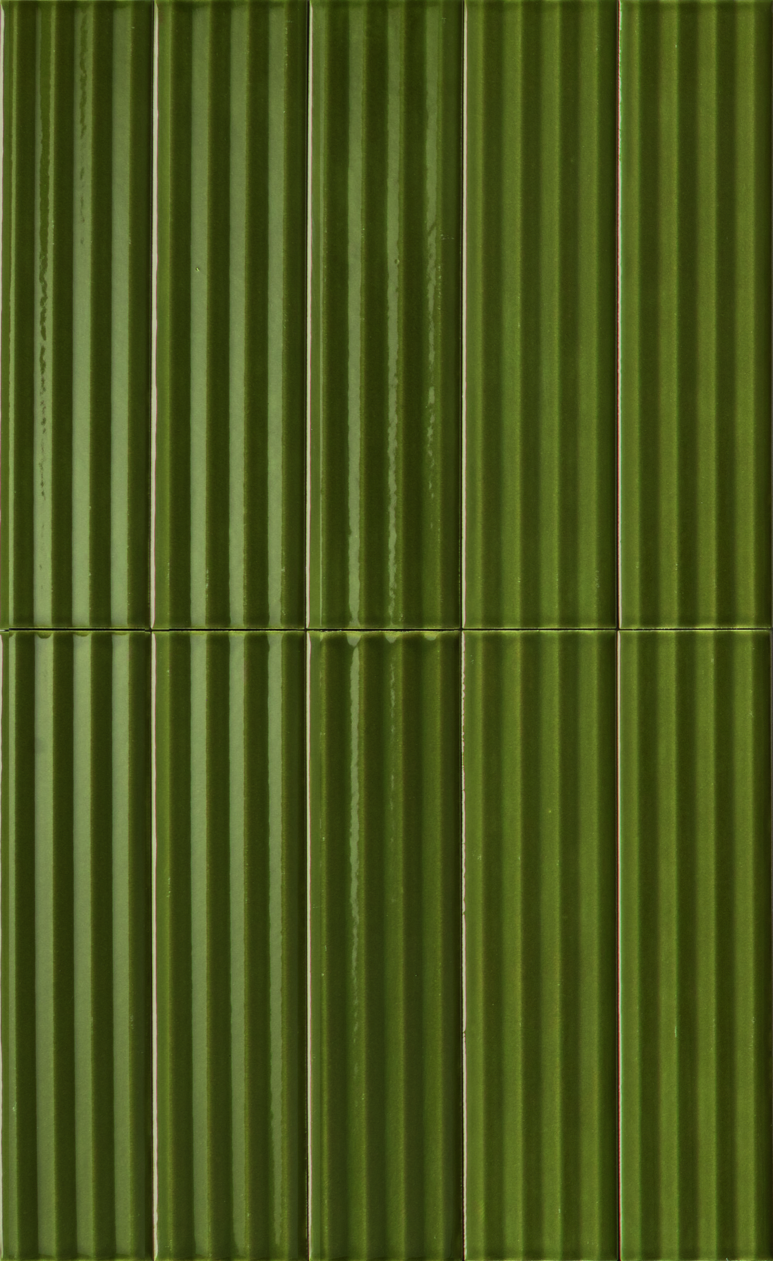
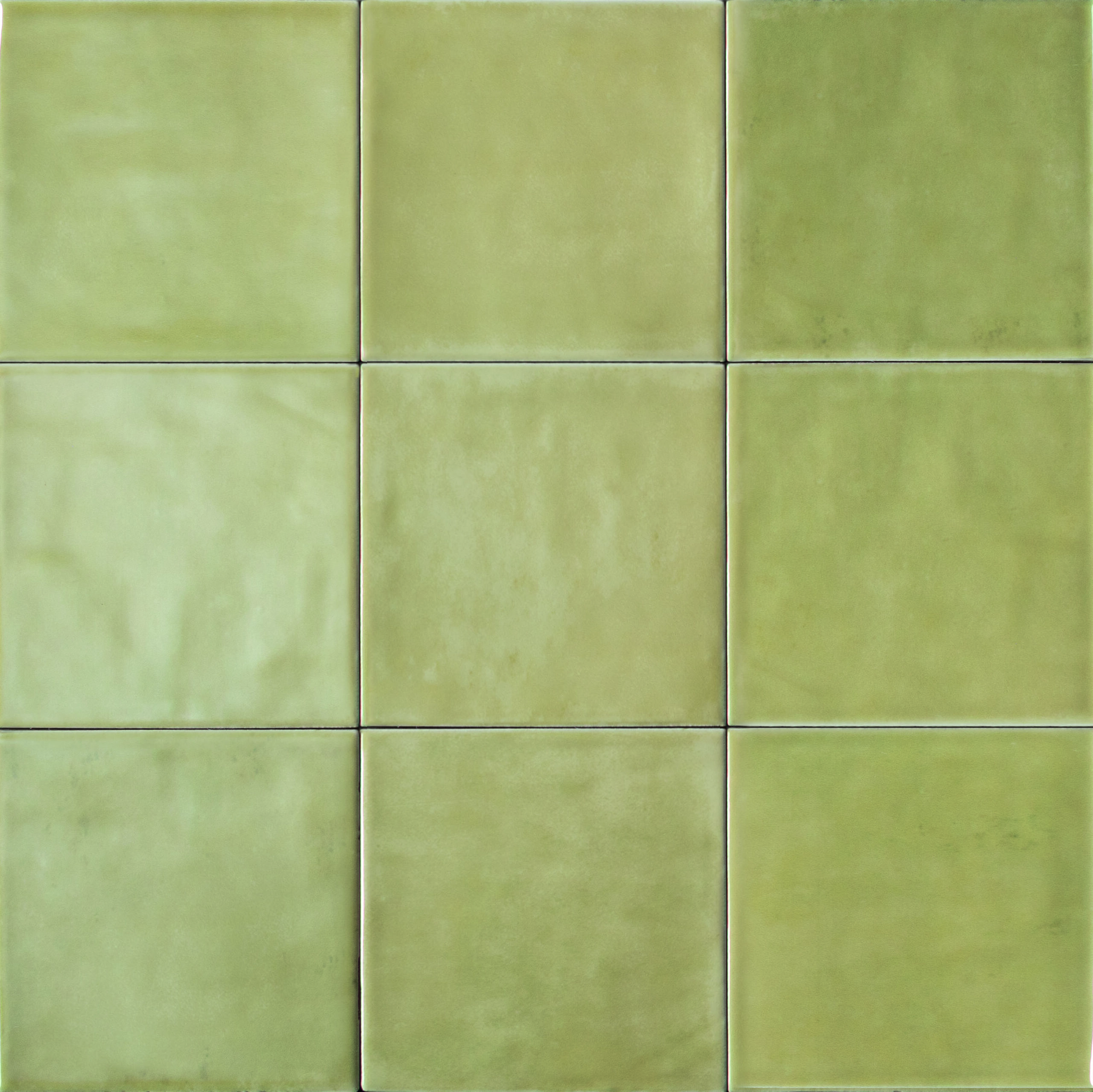
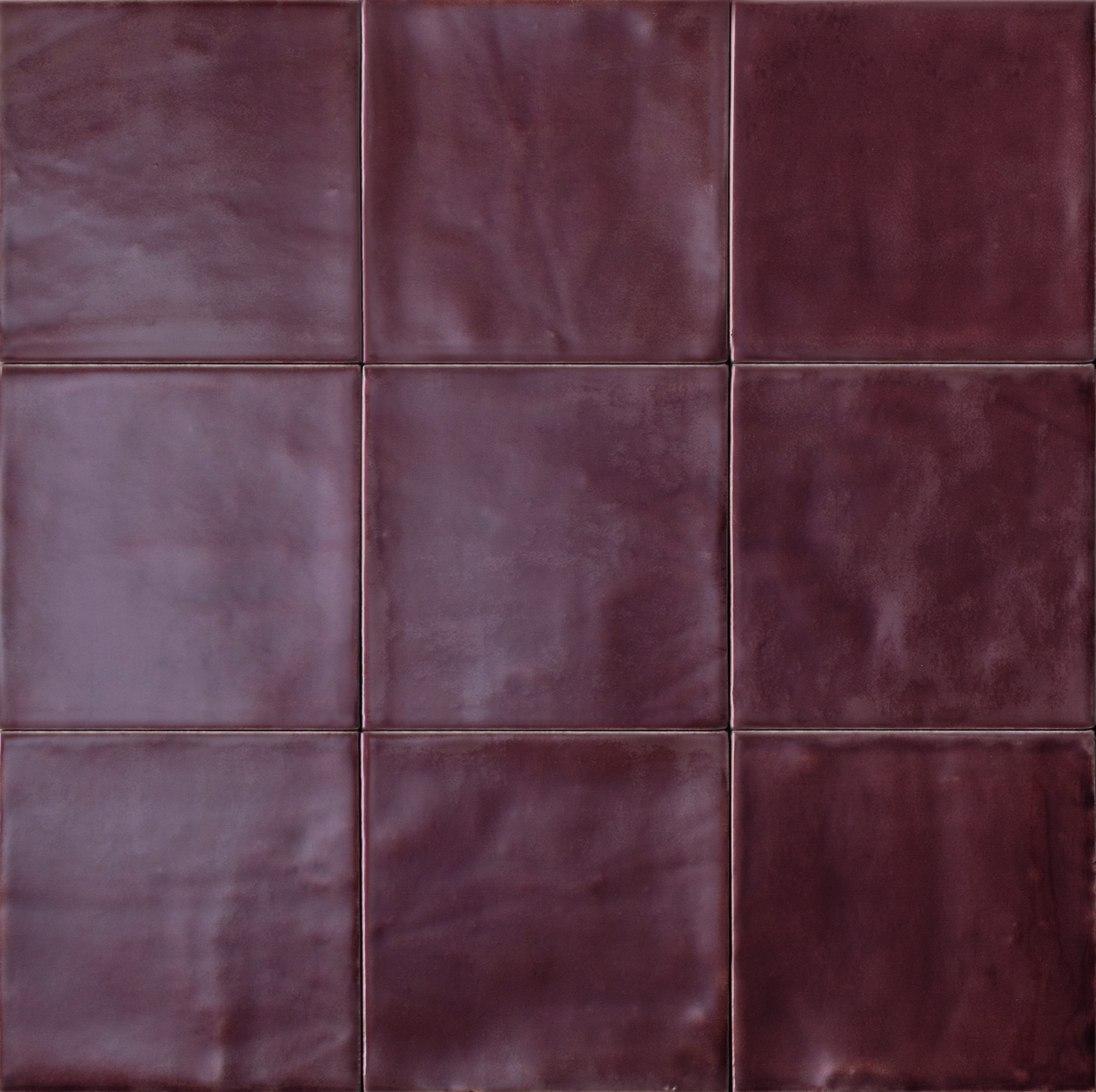
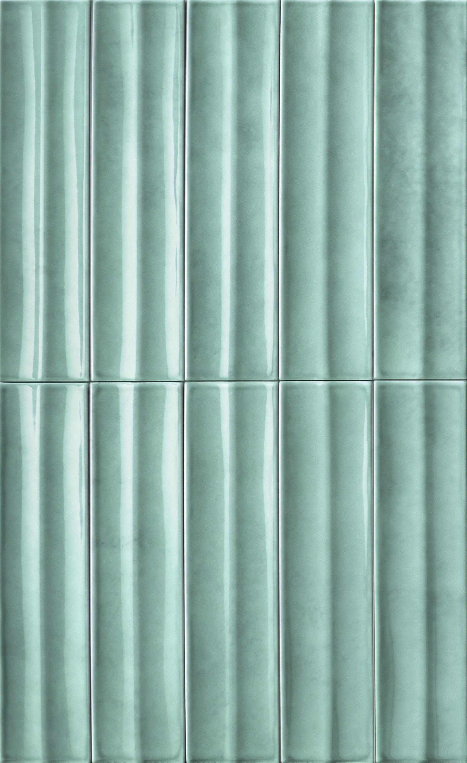
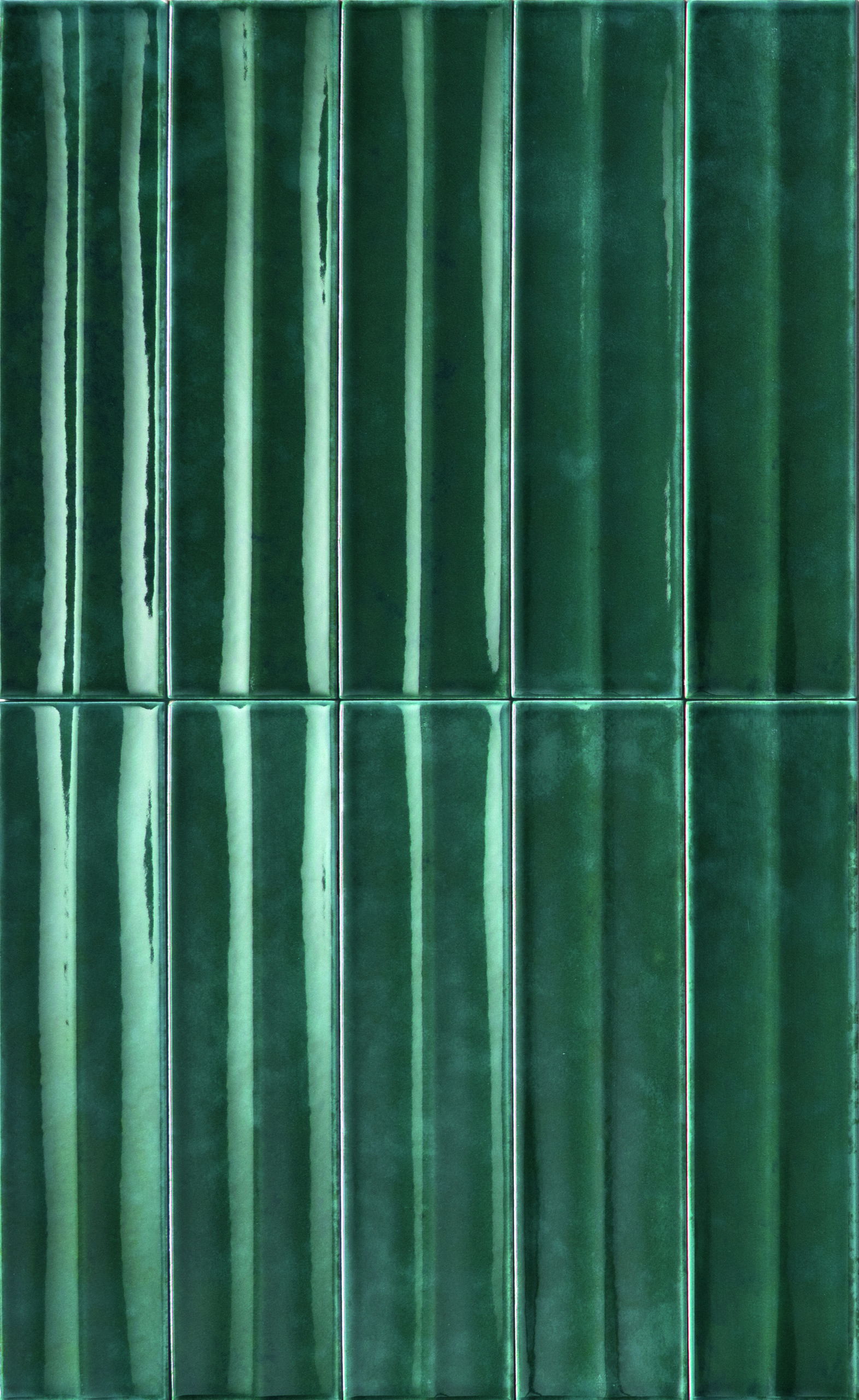
As with Sensi and SensiTerre, also with SensiColore the sensory experience is at the heart of the entire collection. A story that begins with raw material and, through human craftsmanship, arrives at architectural space. The colour palette was born from a careful study of the Italian landscape: 5 chromatic groups with 15 natural shades that capture the country’s diverse territories. The small tile formats, 5.7x23.2 cm and 11.6x11.6 cm, and the wide range of graphic variations recall the charm of artisanal tradition, bringing warmth and handcrafted authenticity back to the surface.
The SensiColore collection by Florim and Matteo Thun & Partners, in porcelain stoneware, is the result of a process that combines precise surface decoration with a deliberately irregular watercolour effect. The coloured body mixtures ensure visual harmony and chromatic consistency across the entire surface. This approach draws inspiration from traditional long-kiln firing techniques, once used in tunnel or muffled kilns, where the oxidation of the biscuit naturally produced cloudy patterns and speckling, now reinterpreted with cutting-edge technology. With multiple graphic variants for each format, every installation becomes a dynamic play of light and colour.
All the Italian landscape colors
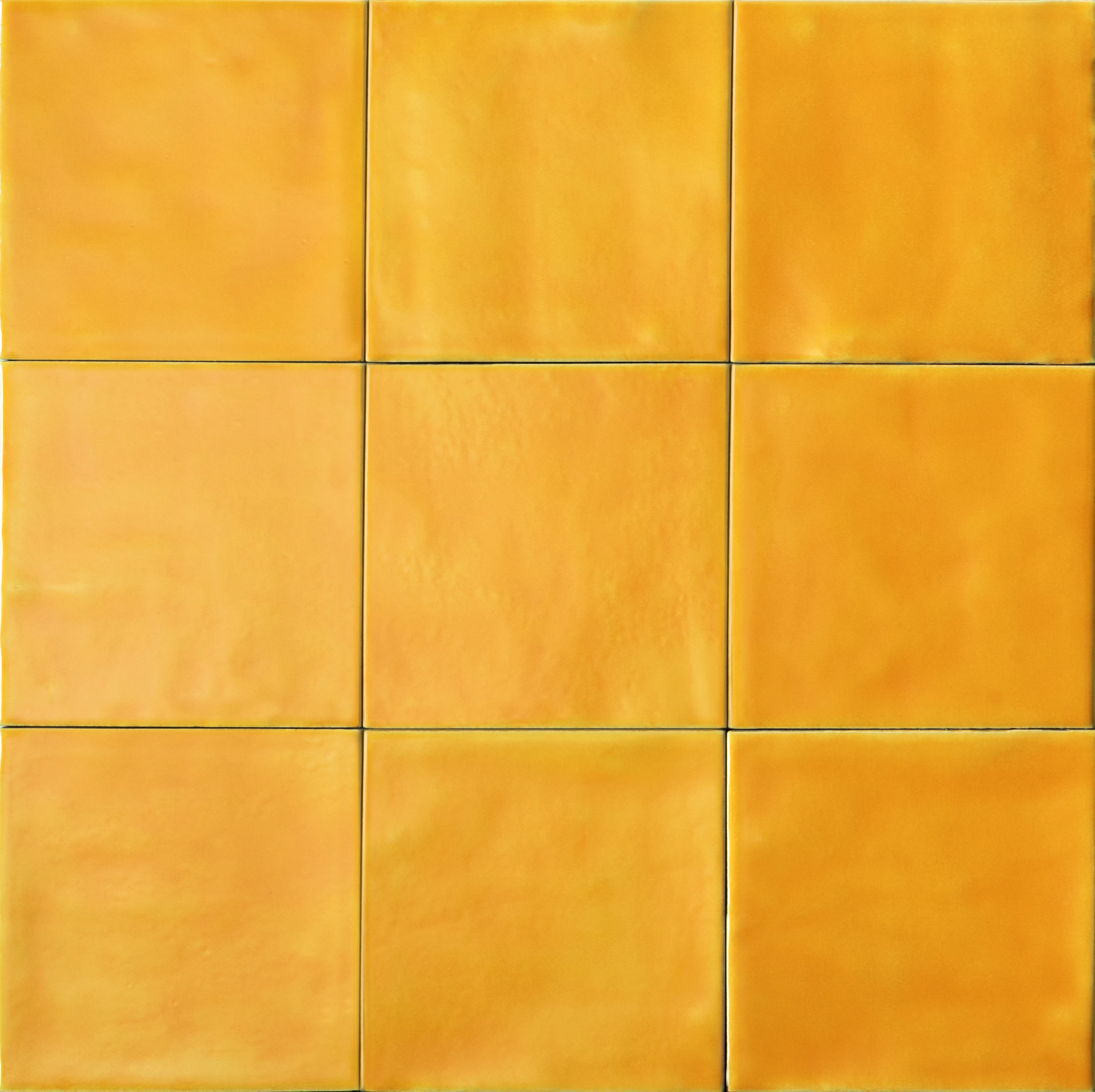
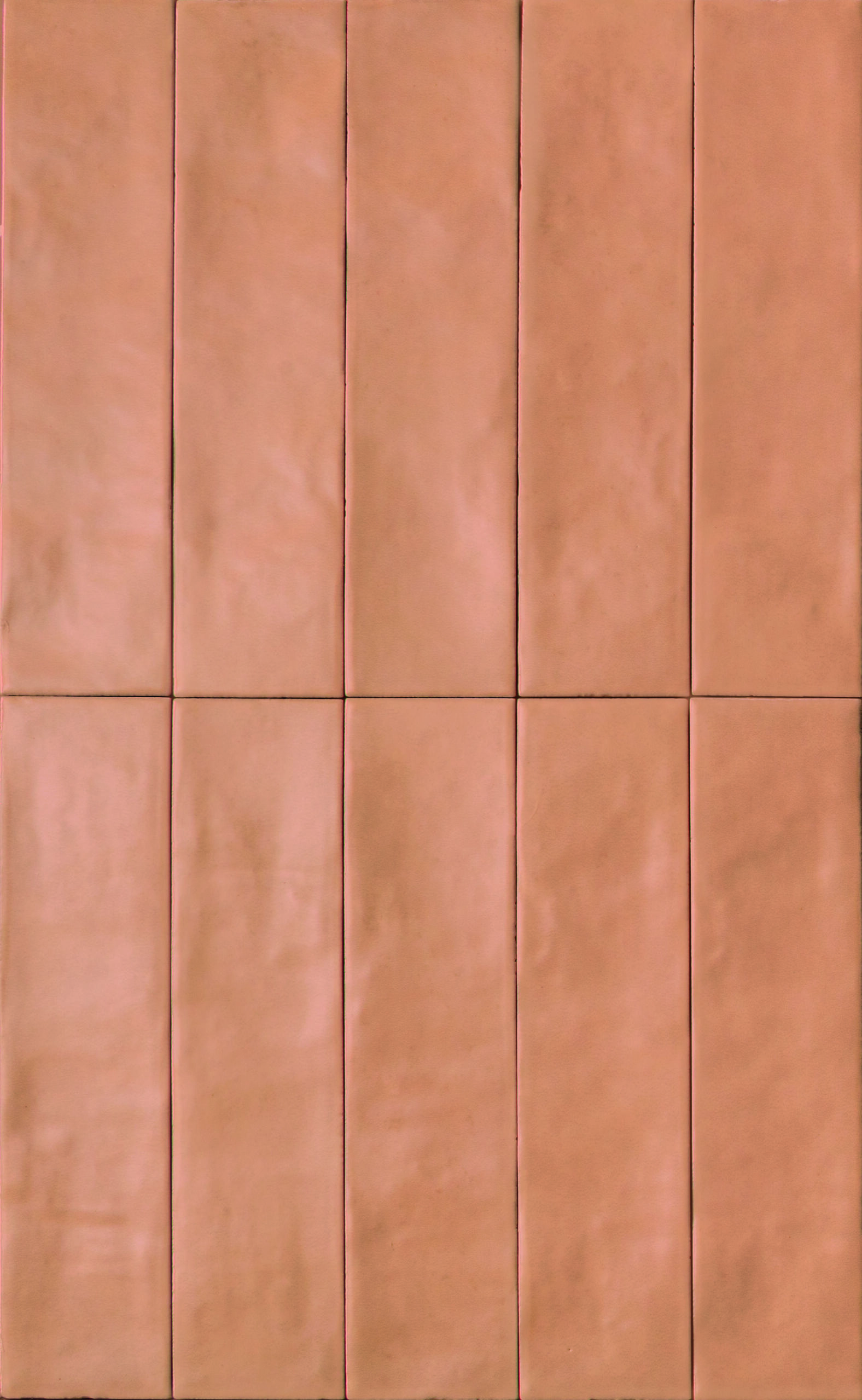

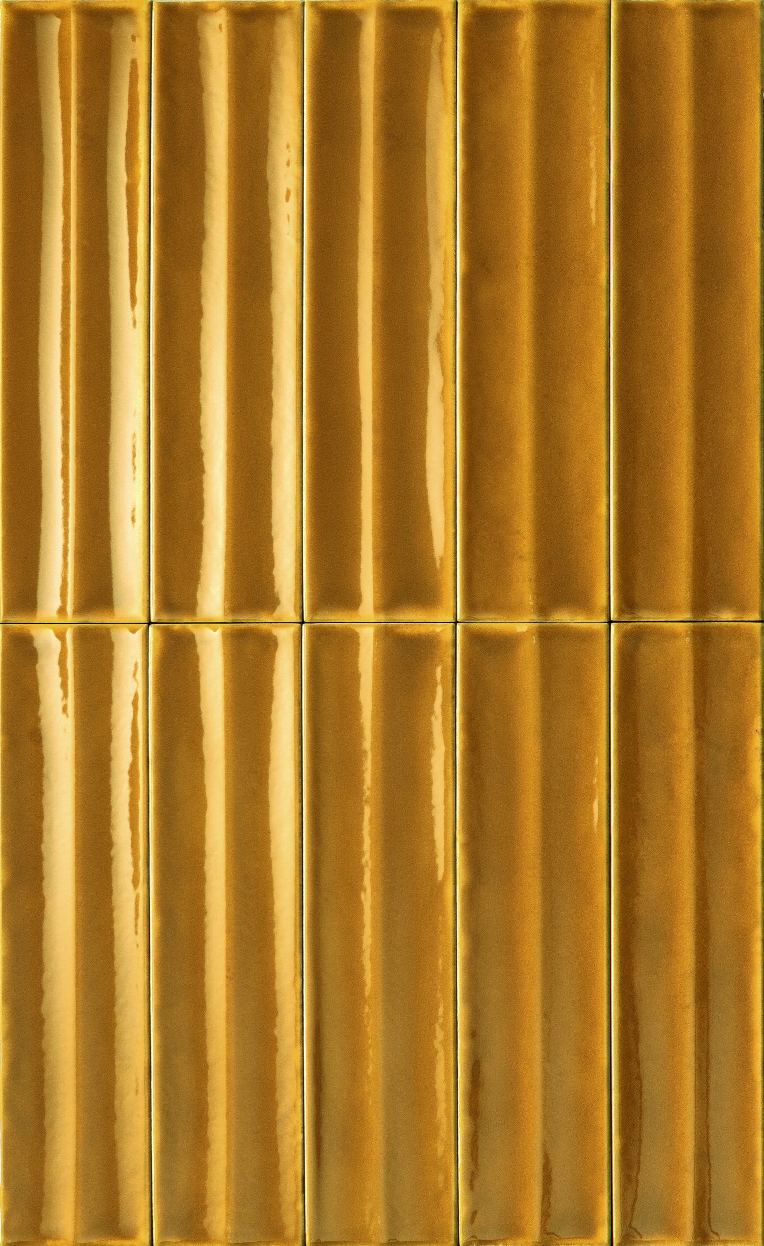
The chromatic journey of SensiColore begins at dawn, on the coasts of Sicily and Sardinia, where light reigns supreme. The chalky white of Scala dei Turchi and the ivory tones of Sardinian beaches open the palette with luminous purity. From Tuscany to the Marche, the palette turns vibrant: warm brick-rosé hues meet orange-ochre sunsets that light up the ploughed fields. These are sunny, energetic tones that evoke golden hills and harmony. Crossing through Emilia, colours grow richer and earthier: shades of brown inspired by autumn leaves, rolling clay hills, and traditional landscapes form a natural, evocative palette.
In Abruzzo, the colours intensify: deep browns and amaranth reds mirror mountain shadows and the warmth of stone-built villages. Between the valleys of Veneto and Trentino, green takes the spotlight. Nature is lush and diverse here, towering mountains, deep valleys, ancient forests, alpine meadows. Finally, we move west, where the landscape turns to blue: the deep blues of Piedmont’s lakes and the brilliant turquoise of the Ligurian Sea. These shades speak of depth and wide-open horizons, clear skies and waters that reflect Mediterranean light. A colour that is both vibrant and deeply personal.


